Our website uses cookies to ensure functionality and provide a better experience. Learn more about how we use cookies in our privacy policy.


First impressions matter, especially online. For many potential customers, your landing page is the first real interaction they have with your financial brand. A strong, streamlined page can convert a casual click into a loyal client.
This article explores seven essential strategies for creating high-performing landing pages that drive conversions and enhance user experience.
Your page should serve one primary purpose: open an account (purchase/submit). Every element, from copy to layout and visuals, should funnel users towards this goal. Eliminate unrelated content or secondary CTAs that may dilute focus or distract users.
Include a clear, compelling CTA in the hero section to immediately capture attention. CTAs should be prominent, action-oriented, and reassuring—using language that emphasizes ease, urgency, and value (e.g., “Open Your Account in Minutes”, “Apply Today”). To maximize visibility and conversion, repeat the CTA at least once more toward the bottom of the page. The goal here is that no user ever has to try to find a CTA. There should always be a simple and easy path to conversion. On mobile, this becomes even more critical, as content stacks vertically and pages feel longer, meaning users are more likely to miss or scroll past your primary CTA without frequent, well-placed reminders.
Users make decisions fast—especially on mobile devices. To improve both user experience and SEO, present content in short, scannable chunks. Favor bullet points and numbered lists over paragraphs, and structure the page with clear, descriptive, and hierarchical headings (using HTML H1, H2, H3 tags) that not only guide the user, but also help search engines, answer engines, and LLMs understand your content.

With most traffic coming from mobile devices, always design for smaller screens first. Keep layouts clean, limit distracting elements, and prioritize fast load times because mobile users especially won’t wait around. Ensure buttons are easily tappable; fonts are legible without zooming and always include a primary CTA that is visible above the fold.
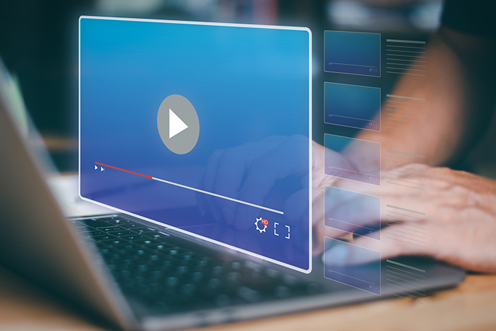
Every image should reinforce the message or guide the user toward action. Avoid decorative or generic imagery that doesn’t add value. Visuals should clarify, not clutter – screen space is limited, especially on mobile. Also, don’t forget to optimize your image and video file sizes for optimal load times, include descriptive alt text for accessibility and compliance, and never (and we mean never) include an auto-play video with sound.
Don’t rely on tabs, drop-downs, or expandable sections for key details. Place critical content directly on the page, so users do not have to look for it. Reducing friction and cognitive load increases the likelihood of a successful conversion.
In the below example from the Interaction Design Foundation, four different courses are presented with extremely efficient information included. In one screen, and with no clicks, you can see all course titles, availability, and start times, each with a simple and clear call to action. This design reduces friction and cognitive load, making it easy for users to take action and increasing the likelihood of conversion.

Exclude on-page jump links, unnecessary links, and off-page paths that can derail the user's journey. Keep users anchored on your page with a seamless, distraction-free experience focused solely on conversion.
Great landing pages don’t happen by accident—they’re built through thoughtful strategy, ongoing tweaks, and a solid understanding of your audience. By implementing these seven key strategies, your financial brand can create landing pages that not only meet compliance standards but also drive conversions via exceptional user experiences.
Ready to transform your landing pages and boost conversions? Contact us today for a personalized assessment of your full digital marketing strategy and learn how we can help you implement these best practices. Just fill out the contact form below!
Join the banks, credit unions, and businesses that have seen 6x web traffic growth and millions of impressions through RAIN's campaigns. Fill out the form and a member of our team will be in touch within two business days to schedule a discovery call.
Most of our clients like us enough they stick with us for the long term. We think you will too.